brique.com

How to Conduct a Comprehensive Website Audit: Visual Guide

Keeping your website optimized through regular audits ensures peak performance, great user experience, and improved SEO. This visual guide walks you through the key areas for auditing your site step-by-step.

1. The Basics: What is a Website Audit?

A website audit is a comprehensive examination of your site’s health, covering SEO, performance, security, and user experience. Regular checks can reveal issues impacting your website’s ranking and user engagement.

2. Analyzing SEO Performance

Visual Aid: SEO Audit Checklist

  • Meta Titles & Descriptions: Ensure they are unique and incorporate targeted keywords.
  • Content Quality: Verify originality and value, avoiding thin or duplicated content.
  • Internal Linking Structure: Confirm links are logical and support navigation.
  • Backlink Review: Use tools like Ahrefs to assess the quality of inbound links.

3. Performance Testing

Infographic: Website Performance Optimization Essentials

  • Page Load Speed: Aim for under three seconds.
  • Image Optimization: Compress images to reduce file size.
  • Minify Code: Remove unnecessary characters in HTML, CSS, JavaScript.
  • Enable Browser Caching: Store resources locally for faster load.
  • Optimize Hosting: Use reliable hosting and CDN service.

4. Security Check

Infographic: Website Security Essentials

  • SSL Certification: Ensure your site uses HTTPS for secure data transmission.
  • Plugin and Software Updates: Keep all elements updated to avoid vulnerabilities.
  • Backup Protocols: Have regular backups in place for quick recovery.
  • Security Scans: Run tools like Sucuri for vulnerability checks.

5. User Experience (UX) Evaluation

Side-by-Side Comparison: Good UX vs. Poor UX

  • Navigation: Make sure your site’s menu is easy to follow.
  • CTAs: Highlight prominent, action-oriented calls to action.
  • Clutter Reduction: Remove disruptive elements like excessive pop-ups.
  • Accessibility Compliance: Ensure the site meets WCAG standards.
6. Top Tools for an In-Depth Analysis

Graphic of Tool Icons with Brief Descriptions

  • Google Analytics: Insight into traffic and user behavior.
  • Screaming Frog: Identify technical SEO issues like broken links.
  • GTmetrix: Performance testing and page load improvement suggestions.
  • Yoast SEO: A tool for on-page SEO analysis.

7. Summarize and Plan for Action

Flowchart: Audit Summary and Priority List

  • Immediate Fixes: Address broken links, critical security updates, and slow load times.
  • Long-Term Goals: Plan content strategy updates and ongoing SEO improvements.
8. Conclusion

A well-executed website audit keeps your site efficient, secure, and user-friendly. Consistent auditing helps you adapt to new challenges and stay ahead in digital performance.

Visit BRIQUE

Ready to boost your website’s performance? Claim your FREE website audit today and uncover the insights you need to enhance SEO, speed, and user experience. Don’t miss this opportunity—get your audit now!

Quandry of a Good User Interface – 404 page

For the uninitiated, a 404 page is the one that is shown when someone tries to reach a nonexistent page on a website. This typically happens when the user clicks a link that leads to a page that doesn’t exist anymore or the user may have mistyped a URL.

This article is one of the many articles that product managers and designers can use as a reference for tips on how to improve their user experience. We prefer to call it the Human Experience. You check out the other blogs

What websites did I check?

I did my research till the time of writing this blog. Some prominent examples that I tested were

  • Google
  • A couple of e-commerce sites like Amazon, Flipkart
  • News sites like The Times of India and BBC
  • Bank sites like HDFC Bank and Citi Bank
  • Airtel, Vodafone
  • Fintech sites like Groww, Scripbox, Happynessfactory

and a few more. Phew! Quite a number of sites. I even searched for a few recommendations on brilliant 404 web page designs. I tried reading a couple of blogs on an appropriate structure and design.

A simple 404 page
An example of a 404 page

All of these websites were very creative about the 404-page that they displayed. Except for The Times of India, of course. It was a simple text-based output on the page that said “Error Occurred.. Click here to browse to The Times of India.”

Were these serving their purpose? Yes, in a way. Are they the way they should be? Definitely not.

So what is the big deal about a 404 page?

Every website will have broken links or mistyped URLs. One cannot help it. An inappropriately structured 404-page will drive your visitors away. A website visitor typically will bounce off your website upon landing here if it doesn’t make any attempt to retain that visitor.

A typical marketing head or a product manager might ask, “What more do you want us to do, Jay?” “What more should this page give you?”

How can a 404-page retain the visitor?

There are many ways in which a 404-page can be smart enough to retain the visitor and enable her/him to find the relevant content on the website. Please do not think that the 404 has no power over the traffic. While some of the sites suggest you implement different techniques to create a powerful 404, I will suggest something else. Why not combine all the techniques together?

Below, I will mention the different elements that, I feel, will definitely add value to the 404 as well as help in the retention of the visitor. All these techniques must be implemented. Not one or two.

A purposeful image

A good image makes a lot of difference. This image should be purposeful and representative of the brand. For example, a company that sells pumps can show an empty spot on the floor of a godown that has a cache of brand new pumps out of the focus area.

A generic e-commerce website can show an empty space on the shelf which is otherwise filled with different types of products. A fashion webstore can show one empty hanger among other hangers with clothes on them.

The image should not be too big. It should be just big enough that the user looks at it and scrolls below. The content below the image has to be visible without a scroll. Also, make sure that you think about the responsiveness of the page, meaning how will the image will look on a mobile device like a tablet or a phone. Crop an appropriate section of the image for the mobile view since the desktop version of the image will get reduced to a small size and thus lose the impact. Following is a very crude example (since I didn’t quite look too hard),

Empty shelf 404 image good user interface desktop view
Desktop view for a veggie e-store 404 page
Empty shelf 404 image good user interface mobile view
Mobile view for a veggie e-store 404 page

An intentful message

The message “404 – page not found” sounds very dull. So does a simple “Page not found”. Be creative. How do the following messages sound?

  • Are you looking for something in particular? – Straightforward
  • Hmm, Something is not right! – Engaging tone
  • Whoa! Parts missing! – Trendy tone
  • Who let the dogs out! – Comic tone
  • Nope! Jack isn’t able to find what you want. – Straightforward, Third-person, Comic

I am sure you can be creative about it. Make sure you retain the tone of the theme of your website. Following is a sample for a vegetable webstore

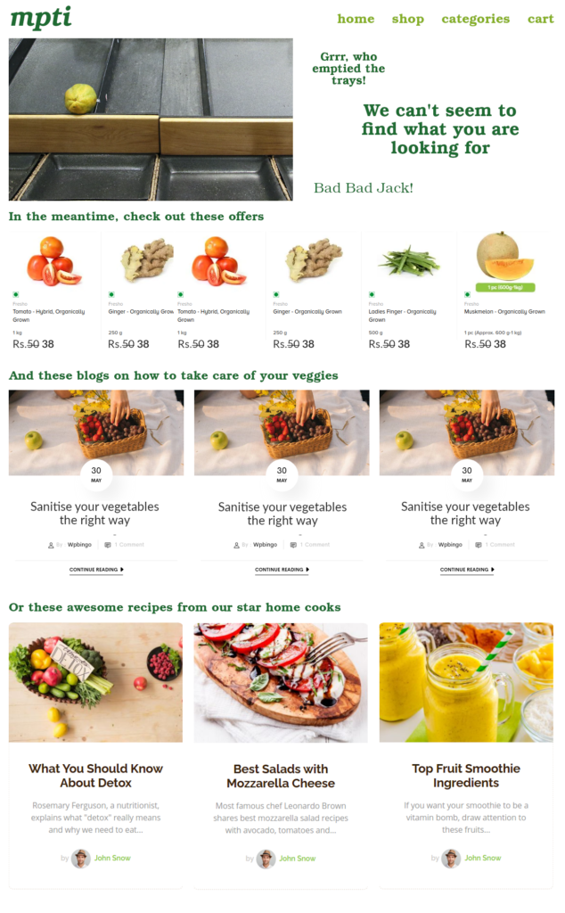
Sample 404 image with text

A conscious redirect

This is the most important element of a 404 page.

Showing the user, all the relevant and potential options on the website makes a greater sense than showing just the text and the image. Once the user views the image and the text, she/he will naturally look below (if the page has been structured well, that is). As opposed to the popular and misguided notion, your users will scroll below as well, as long as they keep finding content.

To take advantage of this behavior, the site should introduce links or content in decreasing order of importance below the image with the text. It can simply be two or three columns full of relevant links to pages, posts, or any other content. This becomes a good place to push content like blogs.

Following is a sample of such a page,

404 page sample design
Sample 404 page

Final thoughts

Nobody thought that a 404 page would have so much importance in the overall scheme of things. It is a small chance that a visitor may land up on this page. But a site owner should leave no stone unturned to steer the user back to the main content of the website and aim to convert the visitor. After all, every visitor is looking for something when she/he lands on a website.

Quandry of a Good User Experience – OTP

Is User Experience misconstrued? Are we looking in the wrong places?

Companies and User experience designers highly misconstrue the concept of User experience. While people tend to apply the same to make the UI of software, apps or websites more “responsible” so to speak, they forget to look at the tiniest bits and pieces in the most obvious places.

Often, in my assignments, I come across requirements where my clients go overboard in the desire to do the user experience and interface functionalities perfect. But, in this quest, they often end up placing the emphasis on the wrong things. They aspire to “make the tables more colorful” or “the page pleasing on the eye”. But pleas to enhance the user experience in small things, as small as, OTPs, fall on deaf ears. Seasoned tech leads and product managers ignore this. We forget that everything we do these days is age-old. The greats have laid it out for us. We are simply mirroring it. In the way, we develop. The way we architect. The way we think. It is quite apparent in our ways.

“Did you just say OTPs, Jay?”

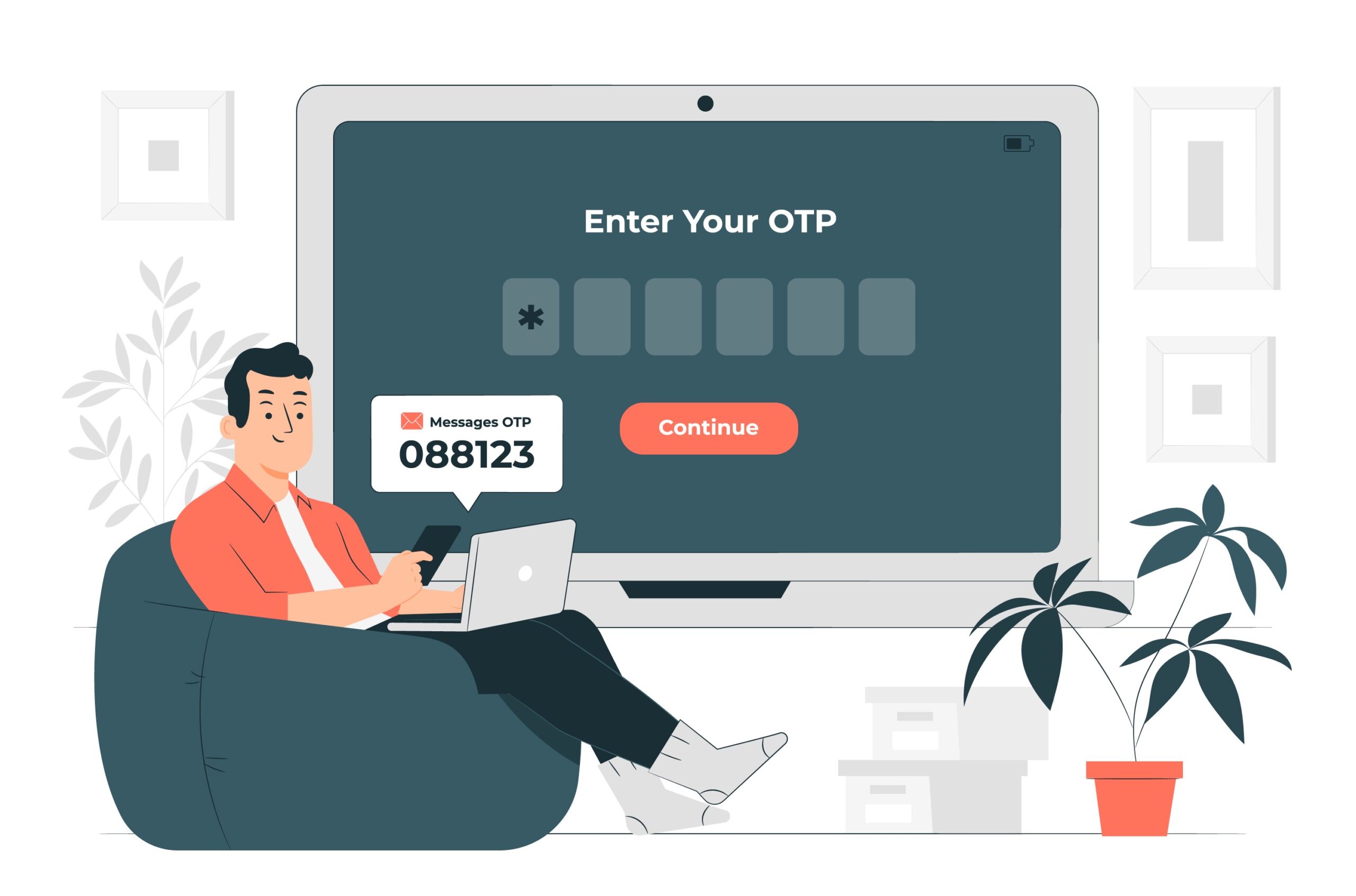
otp on a mobile

Yes, OTPs. You heard it right. “What do you think could be an issue with something as simple as OTPs?” “They are working aren’t they?”

Well yes. And no. They are serving their purpose. Of deterring a uninvited attempt at stealing your money or cracking your login. A second factor authentication. But not necessarily making it any easy for the user.

OTPs often come on SMSes, Whatsapp or emails. These are an application away, a window apart. The OTPs have to be simple enough to be remembered off notifications. Not having to switch between applications to remember.

OTPs are typically developed using random logic. A combination of 6 random numbers. How does “927401” sound? Hmm.. goes my mind. I don’t know about the geniuses out there. But I for one will have to repeat it twice and recall it once to enter this on the OTP screen. Thank God for the keyboards on our smartphones that read this SMS and enter it as well. So much for security.

So the way out?

How does 242424 sound? Or 127127 sound? One look at the OTP and I know what I have to enter. The human mind is wired to remember patterns. It is easy for our minds to remember that “I have to enter 12 three times.” or that “the OTP is 247 and its reverse.”. Now, the user has one less thing to stress about. And that is the elevated experience right there.

Well, there can be a lot of permutations that you can manage, bro. To name a few,

  • 127127 – abcabc
  • 121212 – ababab
  • 111222 – aaabbb
  • 123321 – abccba
  • 112211 – aabbaa
  • 122221 – abbbba
  • 111122 – aaaabb

Yeah yeah, Tech Lead. I hear you. Can we stop the intrusion? Well, the permutations can be endless and easy for the users but maintain the complexity of the implementation. You have to be smart enough to ensure that incorrect OTPs can be tried only a couple of times, max three, after which the OTP expires. The system will force the user to regenerate the OTP after 3 wrong attempts. If this happens, say more than 3 times, the system will block the user for an hour or a day. Simplicity, check! Complexity, check!

This way you will appease the human minds and keep the mischief at bay at the same time.

Is there any way to do this better

Of course there is! A loud shoutout to Bhavya Gudka for that discussion!

How does an OTP like “MUMBAI” sound? Or “PARIS”? Or, for that matter “NEWYORK”? Textual OTPs need not be obfuscated encrypted versions. They can be simple daily use words like city names, prominent leaders, brands, etc. Some suggestions:

  • City/Country names, MUMBAI, PARIS, NDELHI, RUSSIA, THEUSA, THEUKK, GERMAN
  • Prominent leaders, GANDHI, RSBOND, LINCLN, CHRCHL, TERESA
  • Brands, AMAZON, TTESLA, NNOKIA
  • Animals, MONKEY, DONKEY, ZZEBRA, LIONSS

the list can go on.

You might notice the double characters in the above suggestions. I am trying to maintain the 6 characters mandatory length. It is absolutely not necessary to do that. Four characters have enough complexity to prevent guesswork.