
For the uninitiated, a 404 page is the one that is shown when someone tries to reach a nonexistent page on a website. This typically happens when the user clicks a link that leads to a page that doesn’t exist anymore or the user may have mistyped a URL.
This article is one of the many articles that product managers and designers can use as a reference for tips on how to improve their user experience. We prefer to call it the Human Experience. You check out the other blogs
What websites did I check?
I did my research till the time of writing this blog. Some prominent examples that I tested were
- A couple of e-commerce sites like Amazon, Flipkart
- News sites like The Times of India and BBC
- Bank sites like HDFC Bank and Citi Bank
- Airtel, Vodafone
- Fintech sites like Groww, Scripbox, Happynessfactory
and a few more. Phew! Quite a number of sites. I even searched for a few recommendations on brilliant 404 web page designs. I tried reading a couple of blogs on an appropriate structure and design.
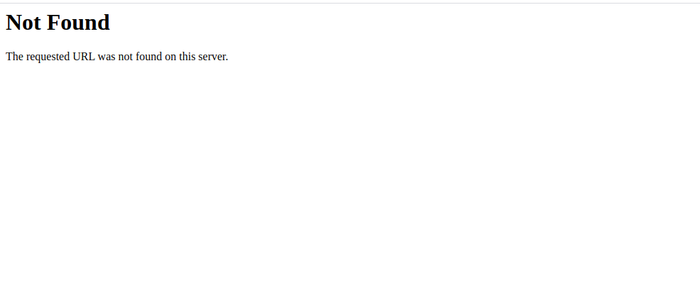
All of these websites were very creative about the 404-page that they displayed. Except for The Times of India, of course. It was a simple text-based output on the page that said “Error Occurred.. Click here to browse to The Times of India.”
Were these serving their purpose? Yes, in a way. Are they the way they should be? Definitely not.
So what is the big deal about a 404 page?
Every website will have broken links or mistyped URLs. One cannot help it. An inappropriately structured 404-page will drive your visitors away. A website visitor typically will bounce off your website upon landing here if it doesn’t make any attempt to retain that visitor.
A typical marketing head or a product manager might ask, “What more do you want us to do, Jay?” “What more should this page give you?”
How can a 404-page retain the visitor?
There are many ways in which a 404-page can be smart enough to retain the visitor and enable her/him to find the relevant content on the website. Please do not think that the 404 has no power over the traffic. While some of the sites suggest you implement different techniques to create a powerful 404, I will suggest something else. Why not combine all the techniques together?
Below, I will mention the different elements that, I feel, will definitely add value to the 404 as well as help in the retention of the visitor. All these techniques must be implemented. Not one or two.
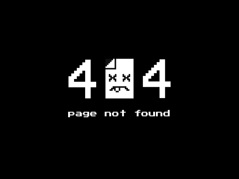
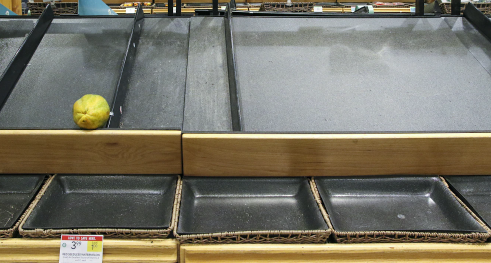
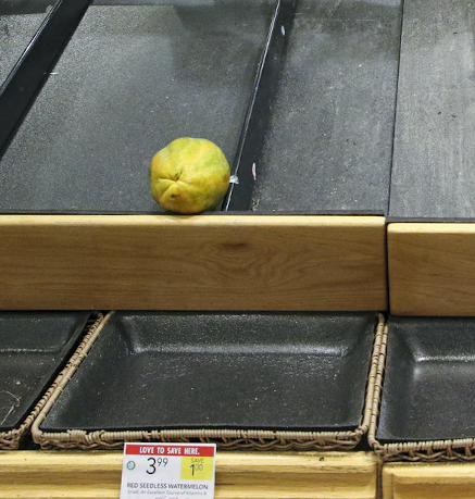
A purposeful image
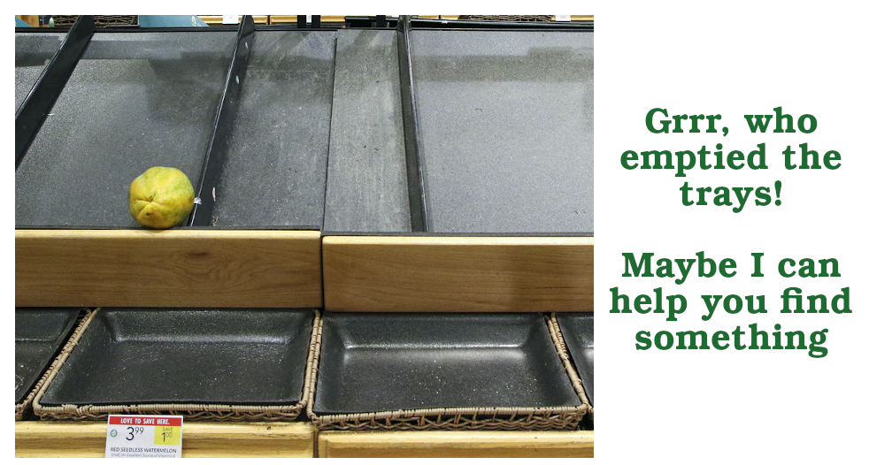
A good image makes a lot of difference. This image should be purposeful and representative of the brand. For example, a company that sells pumps can show an empty spot on the floor of a godown that has a cache of brand new pumps out of the focus area.
A generic e-commerce website can show an empty space on the shelf which is otherwise filled with different types of products. A fashion webstore can show one empty hanger among other hangers with clothes on them.
The image should not be too big. It should be just big enough that the user looks at it and scrolls below. The content below the image has to be visible without a scroll. Also, make sure that you think about the responsiveness of the page, meaning how will the image will look on a mobile device like a tablet or a phone. Crop an appropriate section of the image for the mobile view since the desktop version of the image will get reduced to a small size and thus lose the impact. Following is a very crude example (since I didn’t quite look too hard),
An intentful message
The message “404 – page not found” sounds very dull. So does a simple “Page not found”. Be creative. How do the following messages sound?
- Are you looking for something in particular? – Straightforward
- Hmm, Something is not right! – Engaging tone
- Whoa! Parts missing! – Trendy tone
- Who let the dogs out! – Comic tone
- Nope! Jack isn’t able to find what you want. – Straightforward, Third-person, Comic
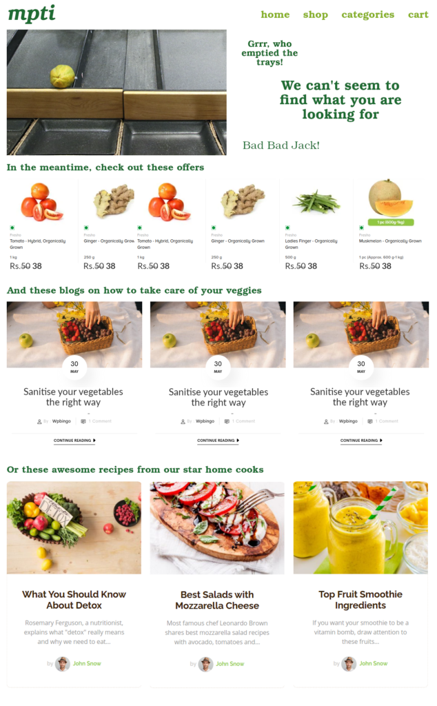
I am sure you can be creative about it. Make sure you retain the tone of the theme of your website. Following is a sample for a vegetable webstore
A conscious redirect
This is the most important element of a 404 page.
Showing the user, all the relevant and potential options on the website makes a greater sense than showing just the text and the image. Once the user views the image and the text, she/he will naturally look below (if the page has been structured well, that is). As opposed to the popular and misguided notion, your users will scroll below as well, as long as they keep finding content.
To take advantage of this behavior, the site should introduce links or content in decreasing order of importance below the image with the text. It can simply be two or three columns full of relevant links to pages, posts, or any other content. This becomes a good place to push content like blogs.
Following is a sample of such a page,
Final thoughts
Nobody thought that a 404 page would have so much importance in the overall scheme of things. It is a small chance that a visitor may land up on this page. But a site owner should leave no stone unturned to steer the user back to the main content of the website and aim to convert the visitor. After all, every visitor is looking for something when she/he lands on a website.