Is User Experience misconstrued? Are we looking in the wrong places?
Companies and User experience designers highly misconstrue the concept of User experience. While people tend to apply the same to make the UI of software, apps or websites more “responsible” so to speak, they forget to look at the tiniest bits and pieces in the most obvious places.
Often, in my assignments, I come across requirements where my clients go overboard in the desire to do the user experience and interface functionalities perfect. But, in this quest, they often end up placing the emphasis on the wrong things. They aspire to “make the tables more colorful” or “the page pleasing on the eye”. But pleas to enhance the user experience in small things, as small as, OTPs, fall on deaf ears. Seasoned tech leads and product managers ignore this. We forget that everything we do these days is age-old. The greats have laid it out for us. We are simply mirroring it. In the way, we develop. The way we architect. The way we think. It is quite apparent in our ways.
“Did you just say OTPs, Jay?”

Yes, OTPs. You heard it right. “What do you think could be an issue with something as simple as OTPs?” “They are working aren’t they?”
Well yes. And no. They are serving their purpose. Of deterring a uninvited attempt at stealing your money or cracking your login. A second factor authentication. But not necessarily making it any easy for the user.
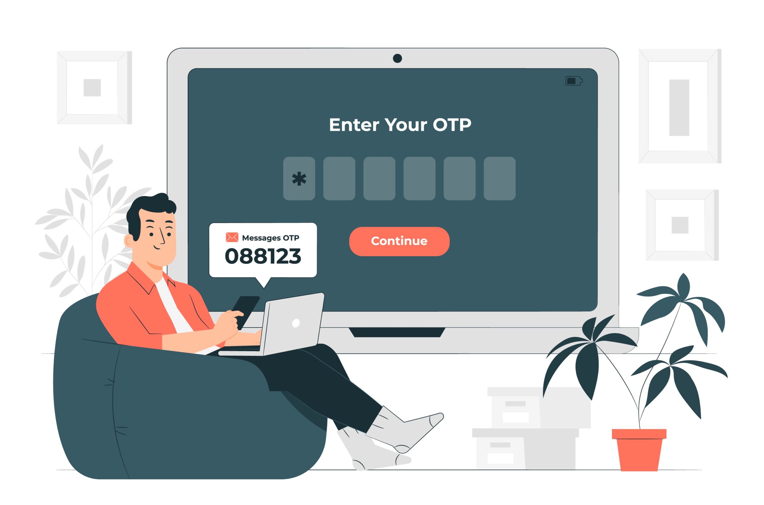
OTPs often come on SMSes, Whatsapp or emails. These are an application away, a window apart. The OTPs have to be simple enough to be remembered off notifications. Not having to switch between applications to remember.
OTPs are typically developed using random logic. A combination of 6 random numbers. How does “927401” sound? Hmm.. goes my mind. I don’t know about the geniuses out there. But I for one will have to repeat it twice and recall it once to enter this on the OTP screen. Thank God for the keyboards on our smartphones that read this SMS and enter it as well. So much for security.
So the way out?
How does 242424 sound? Or 127127 sound? One look at the OTP and I know what I have to enter. The human mind is wired to remember patterns. It is easy for our minds to remember that “I have to enter 12 three times.” or that “the OTP is 247 and its reverse.”. Now, the user has one less thing to stress about. And that is the elevated experience right there.
Well, there can be a lot of permutations that you can manage, bro. To name a few,
- 127127 – abcabc
- 121212 – ababab
- 111222 – aaabbb
- 123321 – abccba
- 112211 – aabbaa
- 122221 – abbbba
- 111122 – aaaabb
Yeah yeah, Tech Lead. I hear you. Can we stop the intrusion? Well, the permutations can be endless and easy for the users but maintain the complexity of the implementation. You have to be smart enough to ensure that incorrect OTPs can be tried only a couple of times, max three, after which the OTP expires. The system will force the user to regenerate the OTP after 3 wrong attempts. If this happens, say more than 3 times, the system will block the user for an hour or a day. Simplicity, check! Complexity, check!
This way you will appease the human minds and keep the mischief at bay at the same time.
Is there any way to do this better
Of course there is! A loud shoutout to Bhavya Gudka for that discussion!
How does an OTP like “MUMBAI” sound? Or “PARIS”? Or, for that matter “NEWYORK”? Textual OTPs need not be obfuscated encrypted versions. They can be simple daily use words like city names, prominent leaders, brands, etc. Some suggestions:
- City/Country names, MUMBAI, PARIS, NDELHI, RUSSIA, THEUSA, THEUKK, GERMAN
- Prominent leaders, GANDHI, RSBOND, LINCLN, CHRCHL, TERESA
- Brands, AMAZON, TTESLA, NNOKIA
- Animals, MONKEY, DONKEY, ZZEBRA, LIONSS
the list can go on.
You might notice the double characters in the above suggestions. I am trying to maintain the 6 characters mandatory length. It is absolutely not necessary to do that. Four characters have enough complexity to prevent guesswork.

